Microsite Design / Concept / Animation
Pitcher & Piano / Peroni Italy: Style Competition
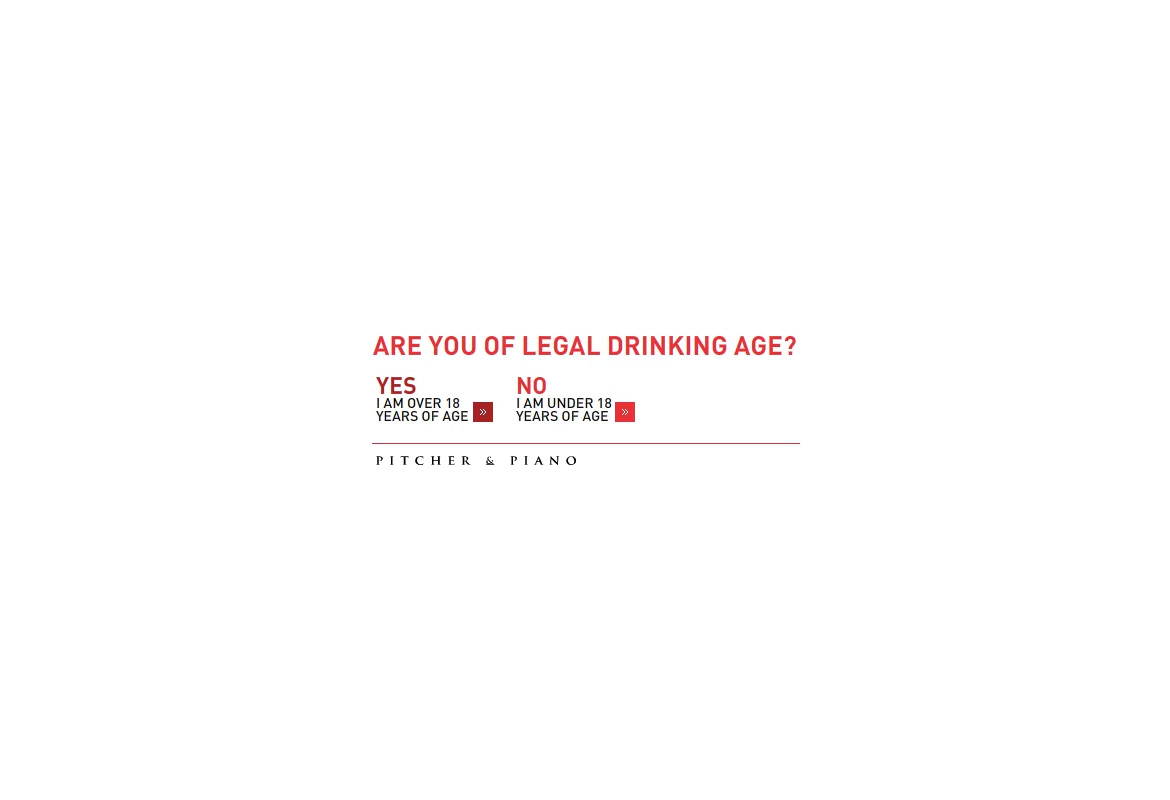
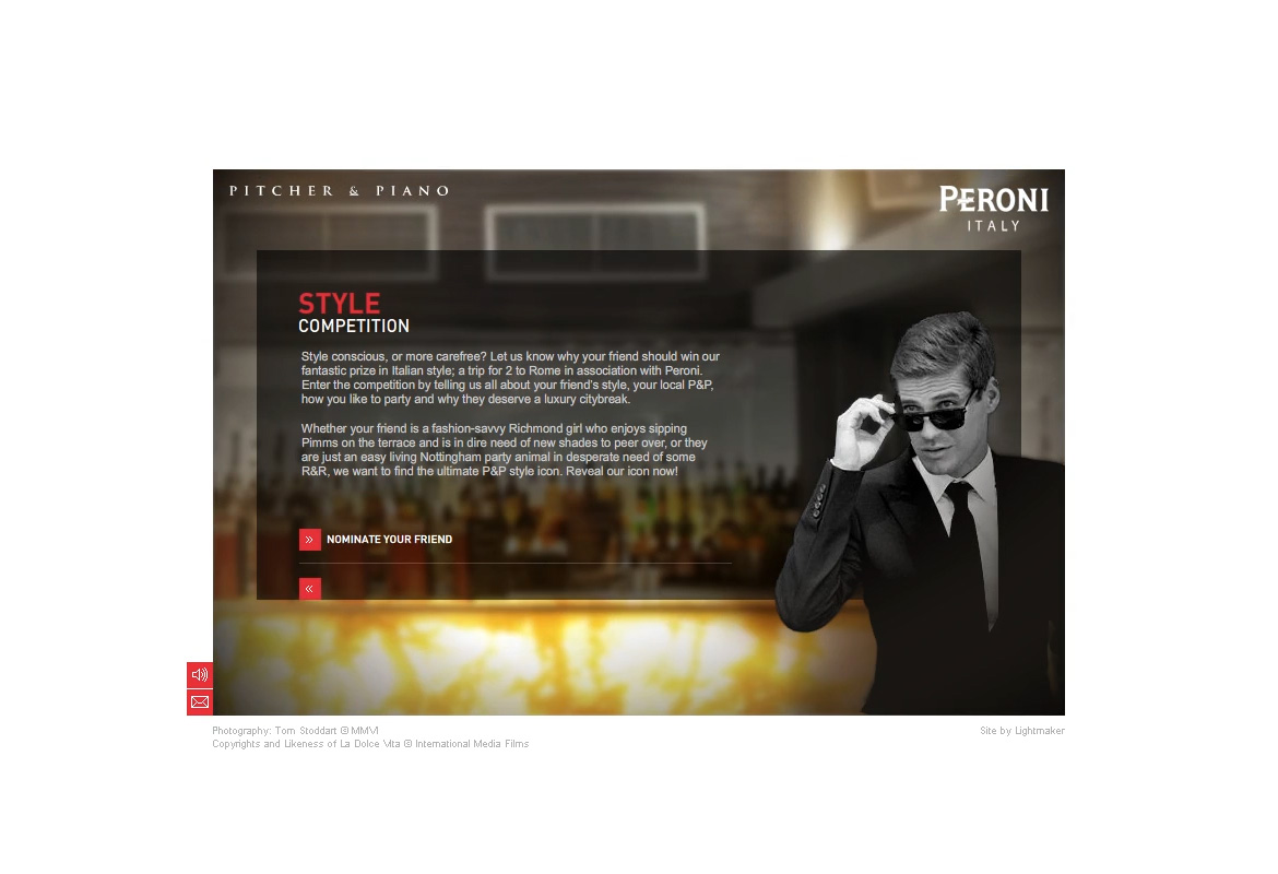
Microsite Web Design, Concept and Animation for an online competition campaign created for Pitcher & Piano and Peroni Italy.
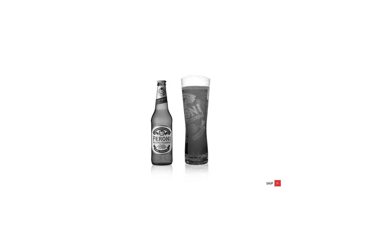
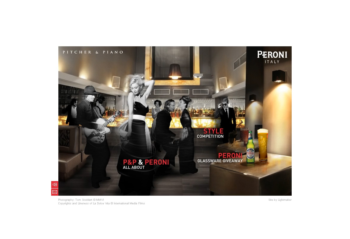
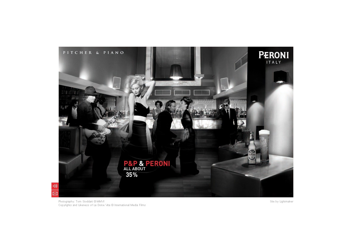
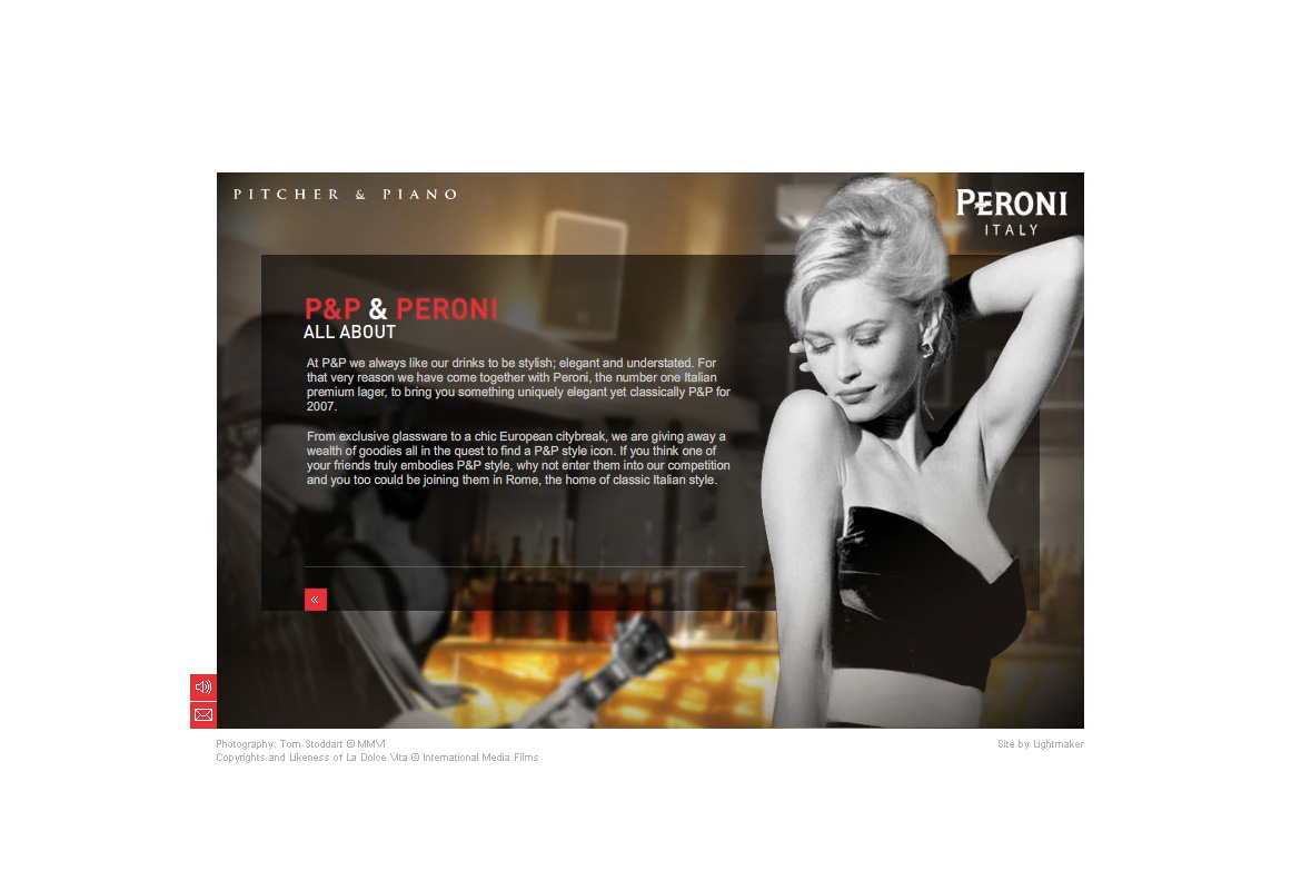
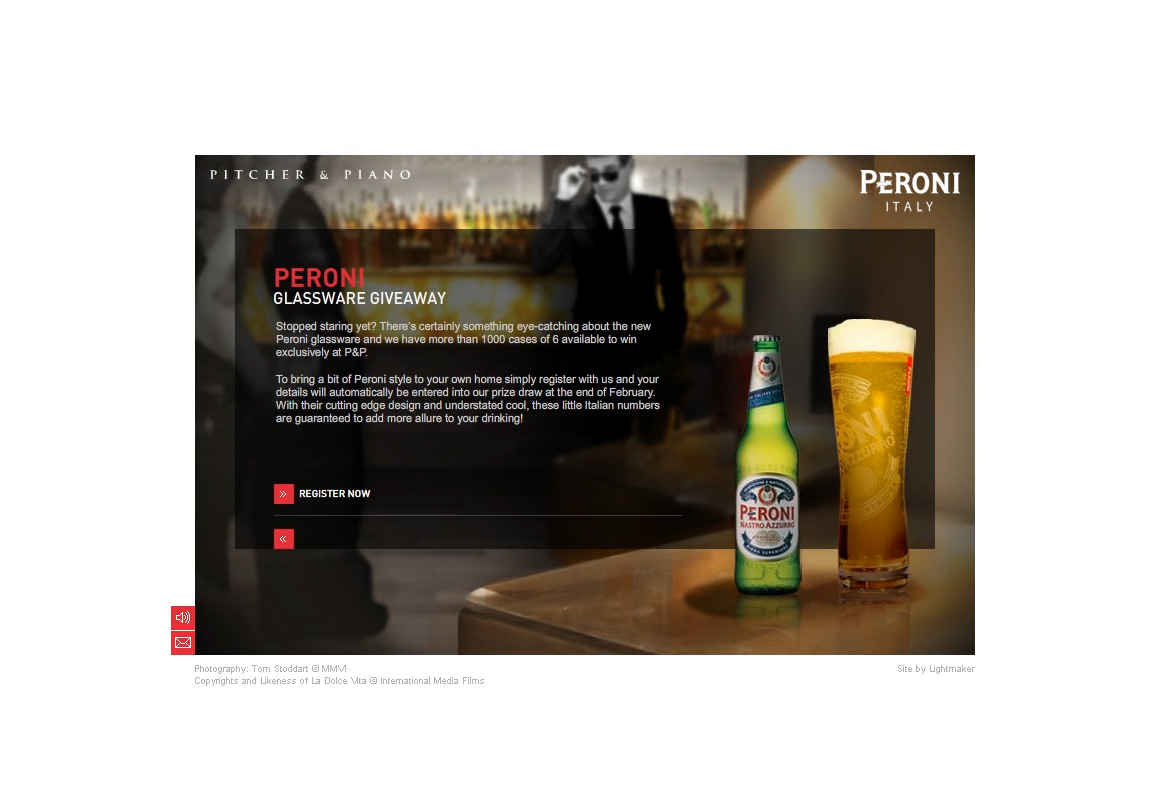
Pitcher & Piano is a nationwide group of bars in the UK and they requested Lightmaker a microsite for a competition promotion between P&P and Peroni of Italy. The brief was open to any creative ideas but unfortunately, the deadline was not since the site needed to be made within 4 working days. I was the design lead on the project, and responsible for the creative concept. For this reason, my creative approach was a very simple blend of the P&P image with the Peroni one. P&P is known for their very stylish and elegant bar interiors and Peroni with their classic black & white image of Dolce Vita. So a good photo manipulation of the two styles blended together, and some simple After Effects work did the trick. I kept the design both, Peroni and P&P branded, with smooth and elegant transitions and within 4 days our small team managed to get this microsite up and running delivering the exact feel of the Pitcher & Piano / Peroni merge.
Role
Creative Direction
Design Lead
Interactive Design
Animation
Client
Pitcher & Piano
Peroni
UK / Italy
Agency
Lightmaker UK
UK
Year
2007
Explore More
Professional Work
